3/20/18
Cover
page
Today
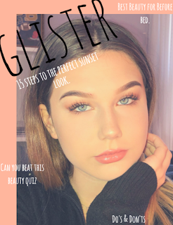
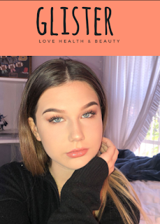
is the day I decide what I choose to be my cover page. For my cover pictures I
have chosen these three.
After
intense research, I realized that every cover picture needs to attract the
audience. In order to do this the person in the picture needs to be staring
into the camera to connect the audience to the magazine. The only issue is the
background of the picture. I thought it was more important to focus on the
model, and then fix the background after. So I was thinking about going on
Pixlr and editing the background to be white and see how it goes. After MULTIPLE failures I decided to leave the background and just work with it.
I did three different previews, and noticed that 5 coverlines was too much. The cover page just seemed way too crowded, and honestly unappealing. I decided to take out one article, and the one I chose was "Why to put onion in your shampoo" for one preview. For another preview I decided to take out was "Do's & Don'ts" and "Best Beauty for Before Bed". And for my last preview I decided not to put any coverlines just to see how it would look.
The three previews are down below:
As I saw these cover pages, it all hit me, this is real. I needed to make a decision and it had to be perfect. I automatically took the second one out, I didn't love it, and I needed to love it. Now picking in between preview one and two. Preview one had life to it, I loved it, it was girly and spontaneous just like I want my magazine to be like. However, I loved preview three also, it was plain, simple, and classy.
I didn't know how to choose, so I decided to take a break, and see it in a day when I had a cleared up mind. I loved both so much, but it isn't only about what I love it is about what is best for business.
I hope you are all as excited as I am to see which choice will win. But until then I hope you guys can wait :)
XOXO Kat :)
Works Cited:
“Pixlr.” Photo Editor Online - Pixlr.com, pixlr.com/.
“Your Browser Is Currently Not Supported on Canva.” Amazingly Simple Graphic Design Software – Canva, www.canva.com/.


Comments
Post a Comment